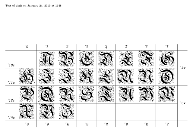
Since 2022, I have been using an ornate letter M for my site logo. I think of it as a digital “stamp”, as you might have for a wax seal. It is from a font called Yinit, which is a reproduction of old, beautiful typefaces out of Germany.

Specifically, Yinit is a set of “chancery initials”, which is a style of calligraphic writing from the medieval chanceries which were offices responsible for creating official documents. Each Yinit letter has as its core a capital in a style called Fraktur, with many thin embellishments around it.
I became interested in Fraktur after discovering this font.
-
Approximate start year for blackletter handwritten script.
This can only ever be approximate because it evolved organically out of earlier use of a different script called Carolingian miniscule.
-
Woodblocks for the Triumphal Arch are completed, which use the first Fraktur printing typeface, commissioned for the woodcut by Emperor Maximilian I.
-
Yannis Haralambous publishes Typesetting Old German: Fraktur, Schwabacher, Gotisch and Initials (PDF) (local archive PDF) including digital fonts of each. He refers to the initials as "chancery initials", and says they are "a revival of baroque designs", and calls his font
yinit.
A screenshot from this test from the Yinit font repository -
Said Achmiz, working with Gwern, converts
yinitto TrueType format for use as dropcaps on the web.
Was Fraktur script distinct from blackletter?
I can’t actually tell if Fraktur was a distinct script style before the printing press. Wikipedia seems to indicate that it was.
Fraktur is a calligraphic hand of the Latin alphabet and any of several blackletter typefaces derived from this hand.
However, the Origin section of that page refers only to the typeface. All of the sources I’ve been able to find about Fraktur are related to its use in print. I’m not sure when Fraktur the script came into use, if it was even thought of as separable from the concept of (what we now think of as) the more general blackletter.
Was “Gothic” a derogatory label?
Wikipedia states:
The term Gothic was first used to describe this script in 15th-century Italy, in the midst of the Renaissance, because Renaissance humanists believed this style was barbaric, and Gothic was a synonym for barbaric.
But it disappoints by a lack of citations for these claims.
They really intrigued me, so I spent some time trying to track down a source, but couldn’t come up with one. I noted this lack on the Talk page for the article, but no one has responded yet. If you have a source for this, please email me.
If we accept this claim anyway, the Fraktur typeface was apparently commissioned for the church after the humanists started to disparage the whole blackletter script family as unsophisticated.
Blackletter: Type and National Identity
Blackletter: Type and National Identity is mentioned all over the web, and two LLMs seem pretty sure that the claim about “gothic” as pejorative comes from there. Unfortunately, it’s not in there.
The official store describes this item as “The monograph1 accompanying the ground-breaking 1998 exhibition of the same name at Cooper Union has been a must-have item for anyone interested in blackletter type.”
(Tracking this book down was a little trouble, although it looks like it’s gotten easier since. When I tried, the official store didn’t appear to have a way to place an order for the book, and I paid twice the sticker price for a used copy on Amazon. Since then, the official store seems to have righted itself, and used prices have come down.)
It was still an interesting read though. Its main focus is the shifting social meaning of the use of blackletter in Germany over time, and there is a lot of technical analysis showing and describing various families of blackletter typeface.
Fraktur and the Nazis
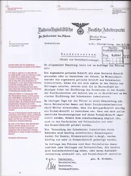
Between the Triumphal Arch and twentieth century computer science, the Fraktur style takes a notable detour into and out of Nazi Germany, being widely used at first before being banned by the Nazi party. The final appendix of Haralambous’s “Typesetting Old German” paper reproduces the Nazis’ so-called normal type decree which banned Fraktur (and another style of typeface called Schwabacher). Haralambous writes,
I would like to thank Frau Franziska Kaiser for finding me (after many attempts) a copy of the official order of the German Nazist Party, abolishing Fraktur and Schwabacher from all printed items. The argumentation given is typical of the Nazist Party (antisemitic and illogical).... Rather a sad way for such a beautiful type to die, especially if one considers all the masterpieces of the first centuries of typography!
That PDF contains the first copy I saw, but it is by far the least legible. The store page for Blackletter: Type and National Identity contains this preview image, the best I could find. (Wikimedia Commons has a lower resolution but still legible version.)

Fraktur and Unicode
Today, a subset of Fraktur letters is encoded in Unicode – not as a separate script for writing, as Fraktur for writing is possible by using normal Latin letters and using a Fraktur font, but intended for use by mathematicians, who apparently have taken to using Fraktur letters when they run out2 of the regular kind.
This means you can use one of those copy paste Unicode converter sites to fulfill Fraktur’s ultimate destiny: to 𝔴𝔯𝔦𝔱𝔢 𝔈𝔫𝔤𝔩𝔦𝔰𝔥 𝔦𝔫 𝔉𝔯𝔞𝔨𝔱𝔲𝔯 𝔩𝔢𝔱𝔱𝔢𝔯𝔰 𝔱𝔥𝔞𝔱 𝔴𝔬𝔯𝔨 𝔬𝔫 𝔗𝔴𝔦𝔱𝔱𝔢𝔯 or whatever.
-
This is apparently how academics spell “book”. ↩︎
-
Per Wikipedia, “Individual Fraktur letters are sometimes used in mathematics, which often denotes associated or parallel concepts by the same letter in different fonts.” ↩︎
