Announcing keymap.click version 1.0!
I built this site to show how my ErgoDox keyboard helped with my RSI. It’s my hope that it will be helpful to other people whose wrists and hands hurt when they type.
The biggest new feature is the guide. It takes you step by step through the most important keys on the board and explains exactly how my nonstandard layout helps me reduce repetitive stress pain. It’s the best way to understand how the layout works overall, and the best introduction to the site.
Changes for 1.0
I’ve completed all the features I planned for the 1.0, not including the stretch goal. It’s time to ship! Here’s what I planned to do before the final release as of my development preview:
-
✅ Provide a guided tour of the map.
Described above, this is a comprehensive overview of not just where I placed the keys, but how that placement helped me.
-
✅ Refine prose that describes the layout.
I had quite a bit of editing to do.
-
✅ Add a few more pages.
I now have pages describing what the site is, what an ErgoDox is, and some personal history. More importantly, I have a system for adding new pages as necessary.
-
🚫 Allow users to pull in keymap information hosted elsewhere on the web. (Stretch goal.)
I’m still interested in that feature, but I decided it was too big a task to accomplish before 1.0. I may revisit this in a future major version.
Over the course of my work, I
fell victim to scope creep
decided to do more after careful consideration:
-
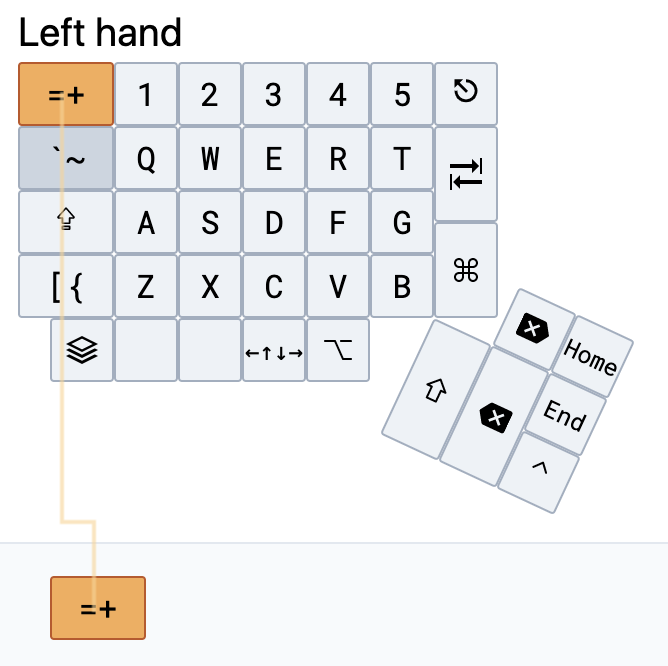
✅ Draw an orange line to selected key.
This indicates which key is selected. It was just a nice-to-have for normal use, but I decided it was really mandatory when using the guide, since it clearly indicates where the user should focus their attention.
-
✅ Improve the menu bar, add a hamburger menu, add a sidebar.
The old menu system worked ok, but it was pretty clunky, and a hamburger menu is a more familiar design pattern.
-
✅ Clean up behind the scenes.
I improved messy state management, separated site-wide state from keymap-specific state, and removed key info parsing code in favor of using HTML classes declaratively.
-
✅ Add a hidden control panel.
I added /controls for a few toggles I wanted during development. End-users won’t need to see this, and it declutters the UI to move debug settings out of the main menu. It also lets me toggle experimental features for others to review. These settings use the JavaScript
localSettingsAPI to persist between page reloads, and are site-wide. -
✅ Solicit feedback from others.
It’s astonishing what I can miss without another pair of eyes.
Layout changes
While thinking this much about my keyboard layout, I couldn’t resist making some tweaks.
I’ve added a second ctrl key under the right hand, and added alt keys on both the left and right. The coolest tweak is my arrow layer, which provides access to arrow keys under either hand.
![]()
A difficult layout bug
I initially wrote this post in mid-September, and as I was writing it, I found a layout bug that took me a long time to get past.
Thankfully, some kind folks on the Tailwind CSS Discord server helped me out. Thanks very much @Robin.
Open source
Critiques, new GitHub issues, contributions, etc are all welcome.
A personal note
I’m really proud of this. I started this project on May 24, and at that time I had never used React, Next.js, or Tailwind for anything at all. I’ve gotten much more comfortable with CSS and JavaScript, tools that have been missing in my toolbox for quite some time. And, while it isn’t perfect by any means, this is the best graphical interface I’ve ever designed. For instance, compare biblemunger to keymap.click. Real progress!